Changelog
Every category is a folder
Each category in the directory is a folder in its own colour, with its first tools peeking out. Hover or tap one to fan them open, and on a phone swipe through them in one row.
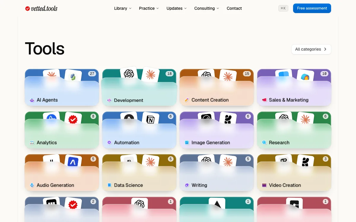
Marked in pen: open one to fan it. Fixes and improvements
- A tool page answers what it does, its use cases, price and fit, and alternatives, in that order
- A category page holds its own folder open, ringed in its colour
- On a phone the list of tools starts on the first screen
Is Agentic shows its maker's logo, Vercel's
Easier to read
Reading text across the site is 16px on a 24px line in full ink, and the main button on each page is bigger, 48px tall.
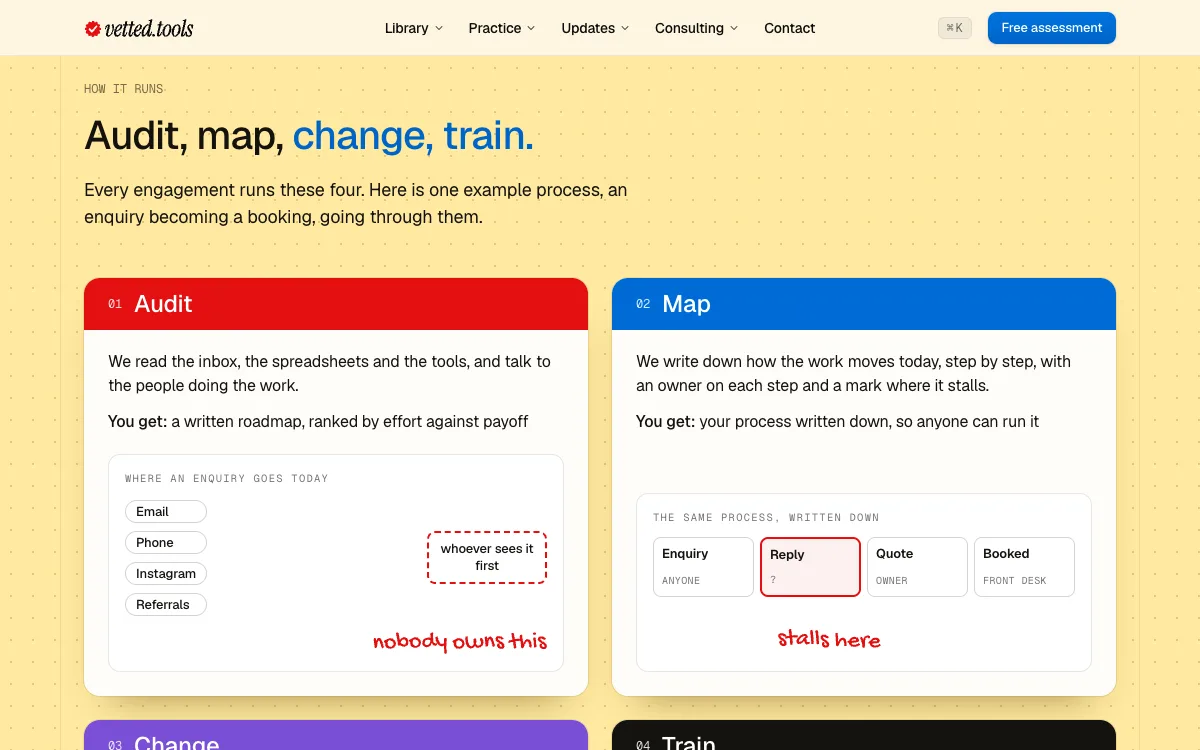
Marked in pen: 16px, full ink. Fixes and improvements
- Supporting lines are 14px, and nothing outside an illustration is smaller than 12px
- Section headings are set a little tighter
- The consulting and service pages read at the same size as everything else
- The type scale is written down in our brand guideline, with the colours, pen marks and Vetty
Consulting, rebuilt
The consulting page and both service pages are rebuilt, and Consulting in the header opens a menu with AI transformation, AI engineering and our work.
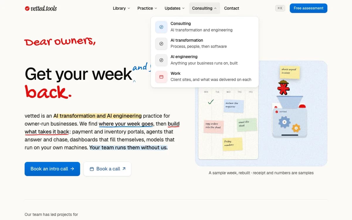
Marked in pen: both service pages. Fixes and improvements
- AI engineering shows ten things we build in four layers, from the website to the printer on the counter
- AI transformation runs through audit, map, change and train, with nine changes in three columns
- Every step of How it runs says what you get from it
- On AI engineering, a quoting tool moves through each stage as you scroll
- Each case on the work page links to its live site
Vetty moves, and talks when you click it
Vetty is never standing still now: it breathes, blinks and hops about its spot. Click any Vetty and it thinks, then writes you a line for the page you're on in blue pen.
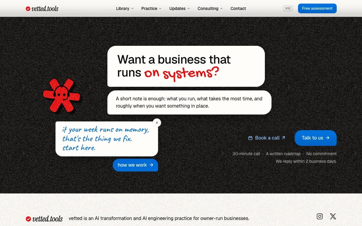
Marked in pen: click any Vetty. Fixes and improvements
- Some of its lines are a knock-knock joke you answer, or a reply that takes you somewhere
- Find Vetty: the footer keeps a tally of the Vettys you've found in this browser
- On the contact page, Vetty stamps your letter Received when it's sent
- Two new costumes, a pencil and a sunhat
Eight new use cases
Eight new use cases, from an instant quote on your website to a scheduled operations agent, each with its sources and every number quoted from them.
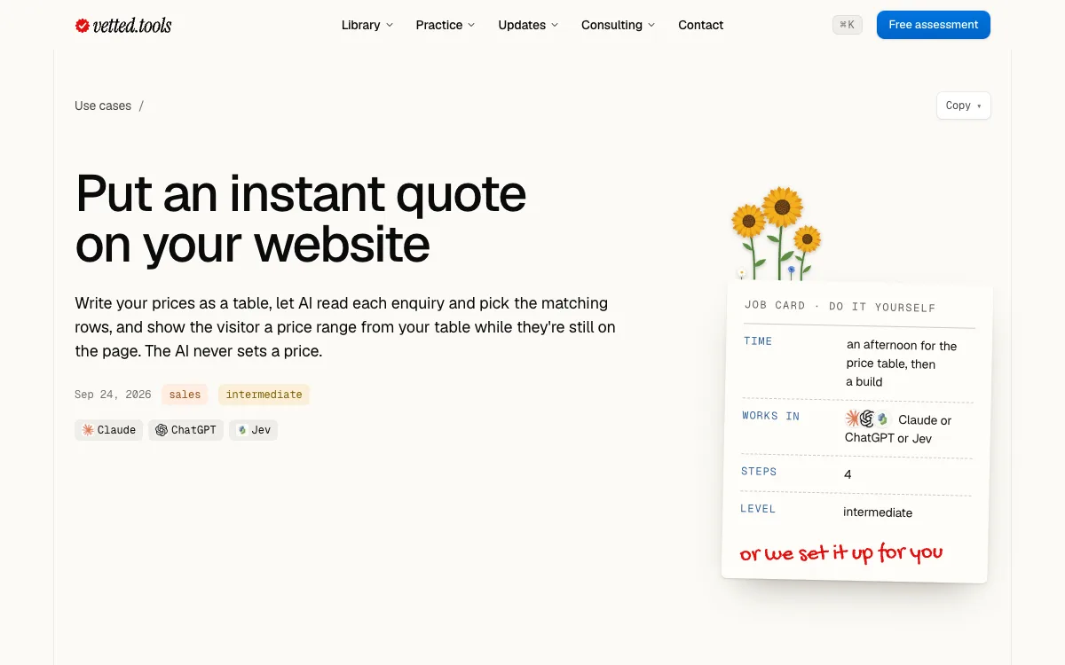
Marked in pen: one of eight new. Fixes and improvements
- For your website: an instant quote, enquiries matched to the right service, and a site AI agents can book and buy on
- For your team: start with one task they hate, and a shared company brain AI can read
- For the back office: a scheduled AI operations agent that checks before it acts
- For marketing: old blog posts refreshed for search, and a brand kit from one reference image
- The six tools these use cases run on are now in the directory
See how far along the assessment you are
The assessment shows your progress beside the questions as you answer, and your roadmap now arrives by email. The weekly brief is added only if you tick the box.
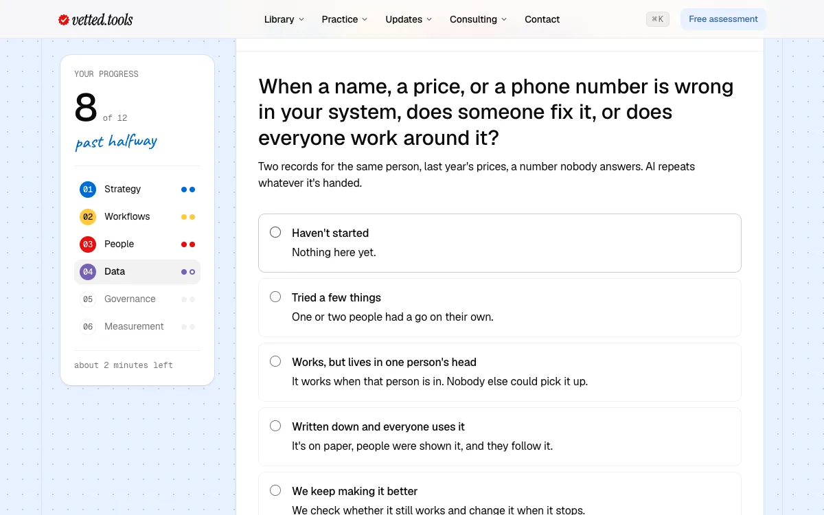
Marked in pen: how far you are. Fixes and improvements
- On a phone, a sticky bar counts your answers in twelve segments
- Your result's three moves sit on a dotted band, one colour per area
- Get our take is now a work order, and Vetty stamps it Received once it's sent
- Tags are one size everywhere they appear
One look on every page
We pulled the redesign back into one site: every page title on one scale, plain paper under the reading, grain kept for a few bands, and one kind of closing section for each kind of page.
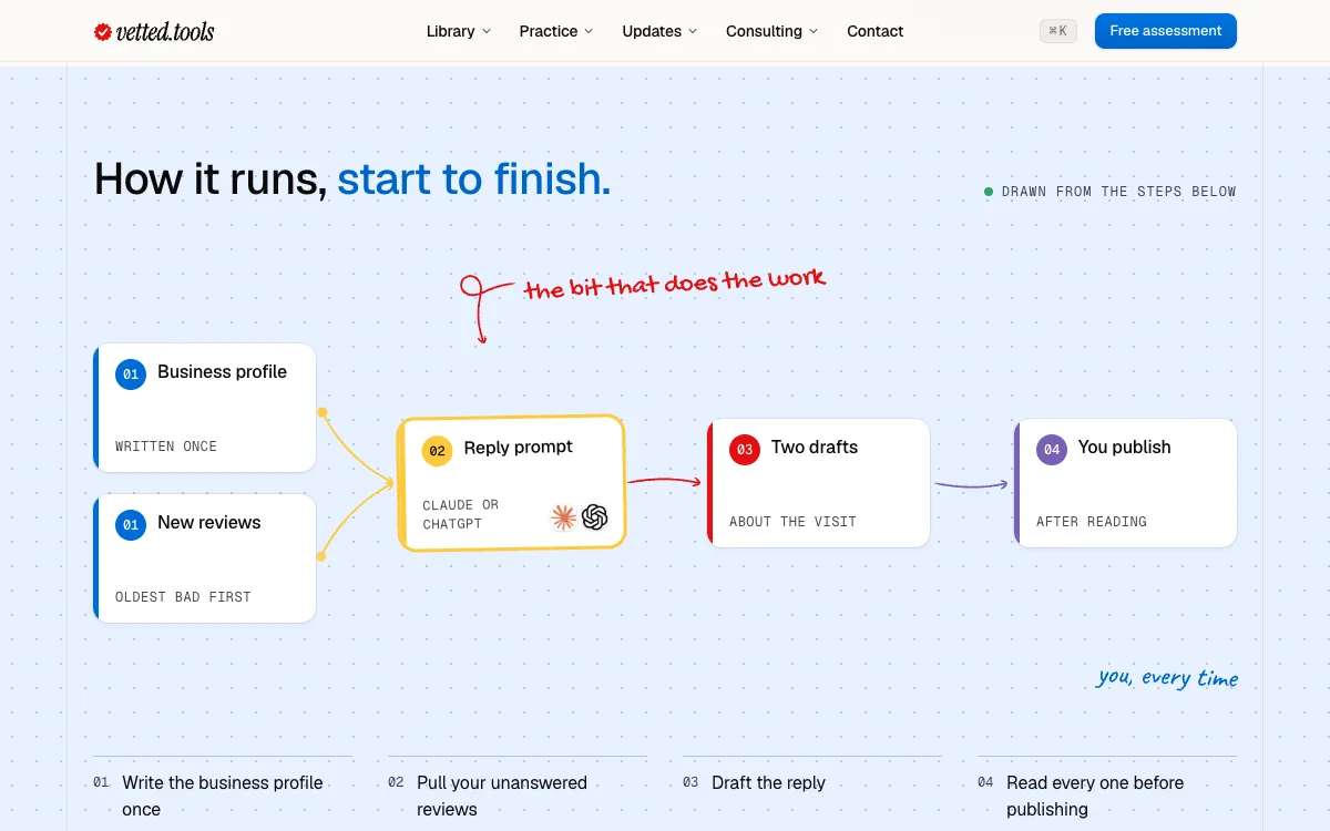
Marked in pen: one diagram per use case. Fixes and improvements
- Forms and cards sit on solid white, never on grain
- Handwriting writes itself in as you scroll to it
- Each use case has one process diagram, in colour, with its tools' logos
- This page shows the last eight weeks as a calendar, with release days ringed in coral
- The footer's links are 16px, and its social icons have bigger tap targets
Dark mode
The site now has a dark theme. It follows your system setting, or pick Light or Dark at the foot of any page, and a dark page is dark from the first frame.
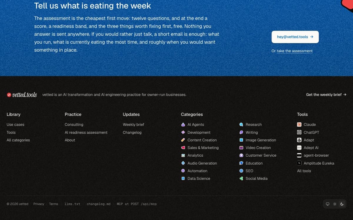
Marked in pen: system, light or dark. Fixes and improvements
- Your choice is remembered on this device
- Pen marks, category colours and code blocks all have dark versions that stay readable
- Printing a page still prints on white, whatever the theme
Marked up by hand
Use cases are now marked up in pen: the line that matters most is highlighted or underlined, some with a margin note, so you can skim for what counts.
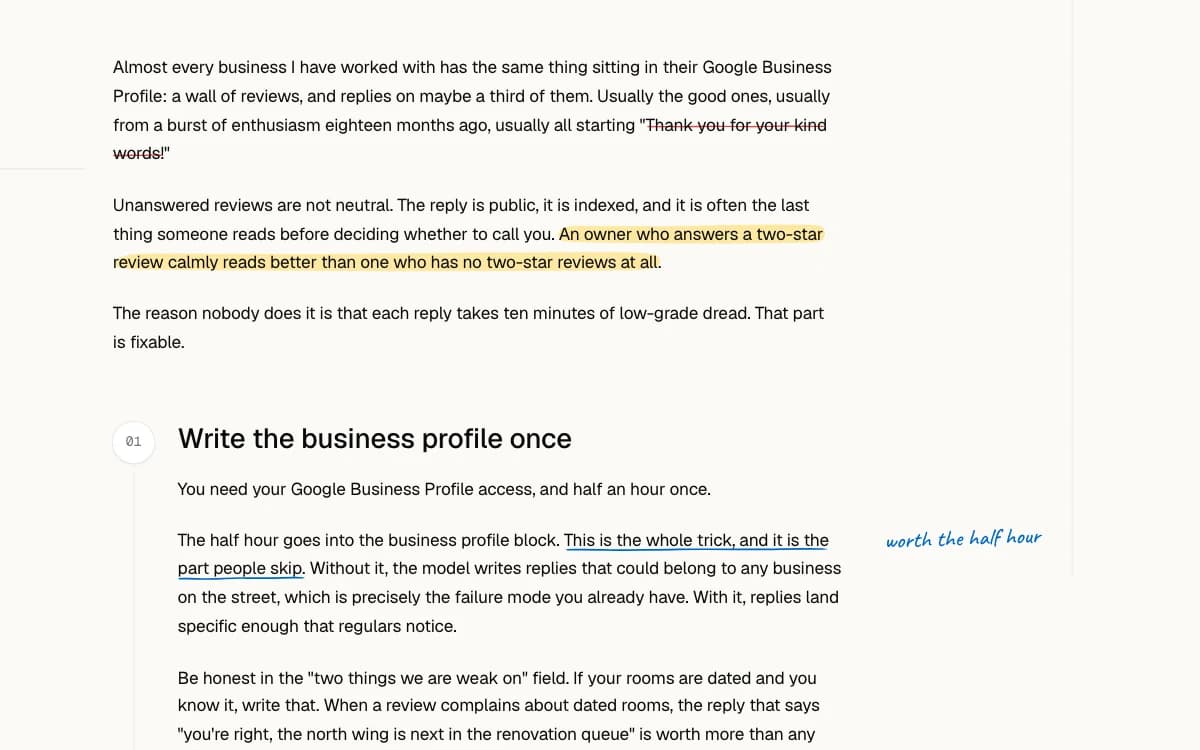
Marked in pen: marked by hand. Fixes and improvements
- A new mark: a coral stamp beside the vetted.tools name, and a favicon to match
- Tool pages carry a seal when one of our use cases runs the tool
- Client work is a wall of cards, each in the client's own colours, with a fourth case added
- The home page's picture is the real tools page, marked up in pen
- Technical level reads out of 5 everywhere, the markdown copies included
Browse the directory your way
Browse the directory as a list, a grid of covers or grouped by category, and it remembers your choice. Filters stay pinned, and tools carry a one-line tagline.
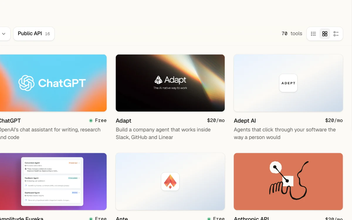
Marked in pen: list, grid or by category. Fixes and improvements
- Hover a tool in the list to preview its cover and web address
- Categories are cards that show how many tools each one holds
- Price, platform and level are plain dropdowns on one bar
- Breadcrumbs read as links, with a slash after each step
- The claim and badge links for makers fold into one line at the foot of each tool page
Claim your listing, or add our badge
If you make a tool listed here, you can claim its page, suggest an edit or add our badge to your site. The tools page also became a list you scan in one pass.
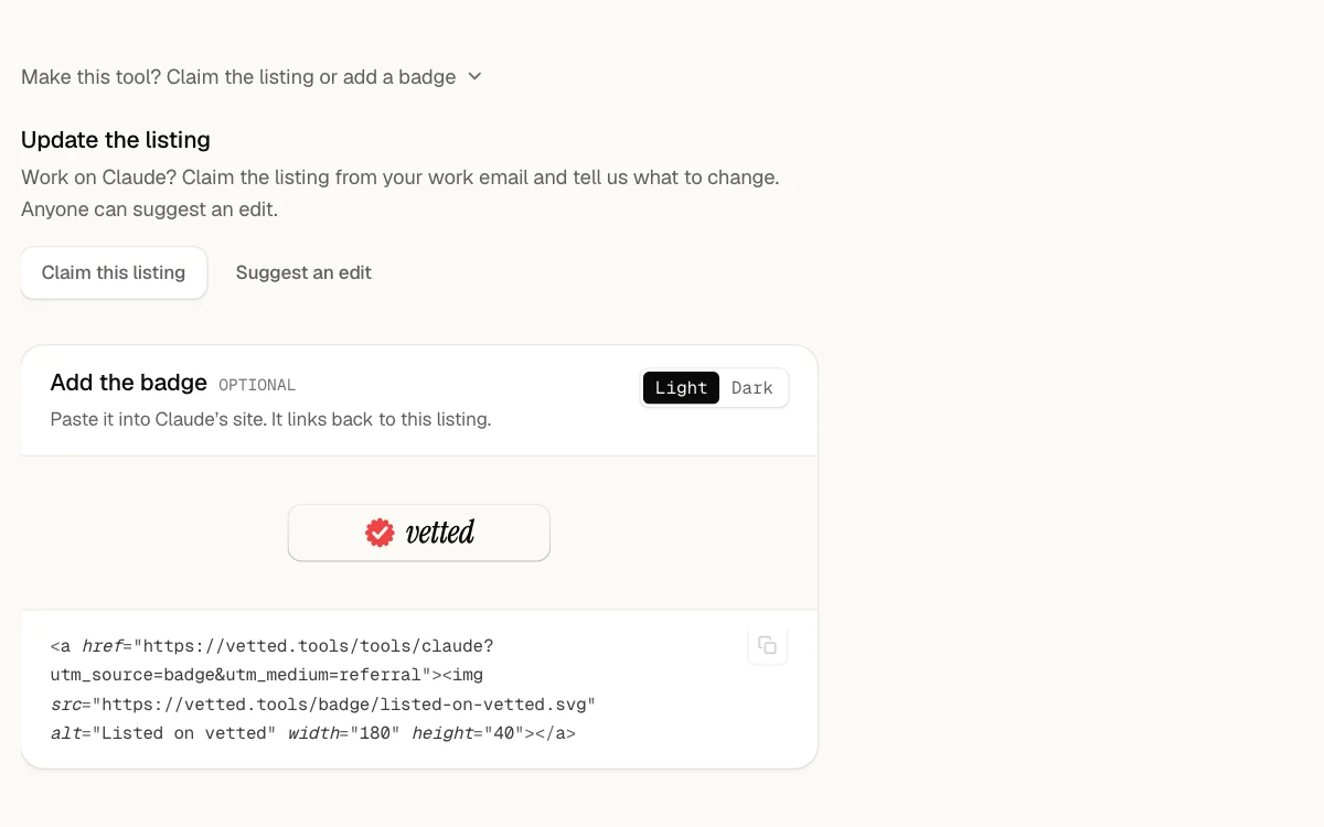
Marked in pen: for your own site. Fixes and improvements
- The footer is about 40% shorter: one row of links and a closing line
- The newsletter page now lives on the brief page, and old links go there
- On a phone, the category chips scroll in one row, and a second category that does not fit folds into +N
- Page animations play once per visit, not on every page you open
- A tool whose cover fails to load still shows a designed card
Consulting in the header
Consulting now has its own link in the header, beside the menus. On a phone, the footer folds its links into groups you open, so it is under half as long.
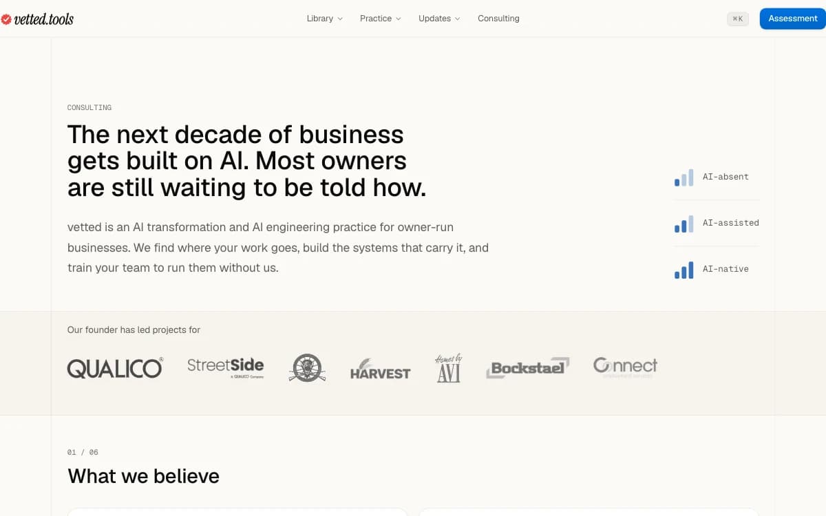
Marked in pen: a link of its own. Fixes and improvements
- Links like All use cases and See the work are buttons now, and their chevron turns into an arrow on hover
- The consulting page answers seven common questions, four of them new, in two columns on a wide screen
- Each use case in a list carries a small mark for its category
- Case pages gain three more before-and-after comparisons, and the slider works with Reduce Motion on
- On a wide screen, each release here keeps its version and date in a column to its left
Our client work, case by case
Each client engagement has its own page: what we delivered and, where we replaced a site, a slider to compare the old one with ours, section by section.
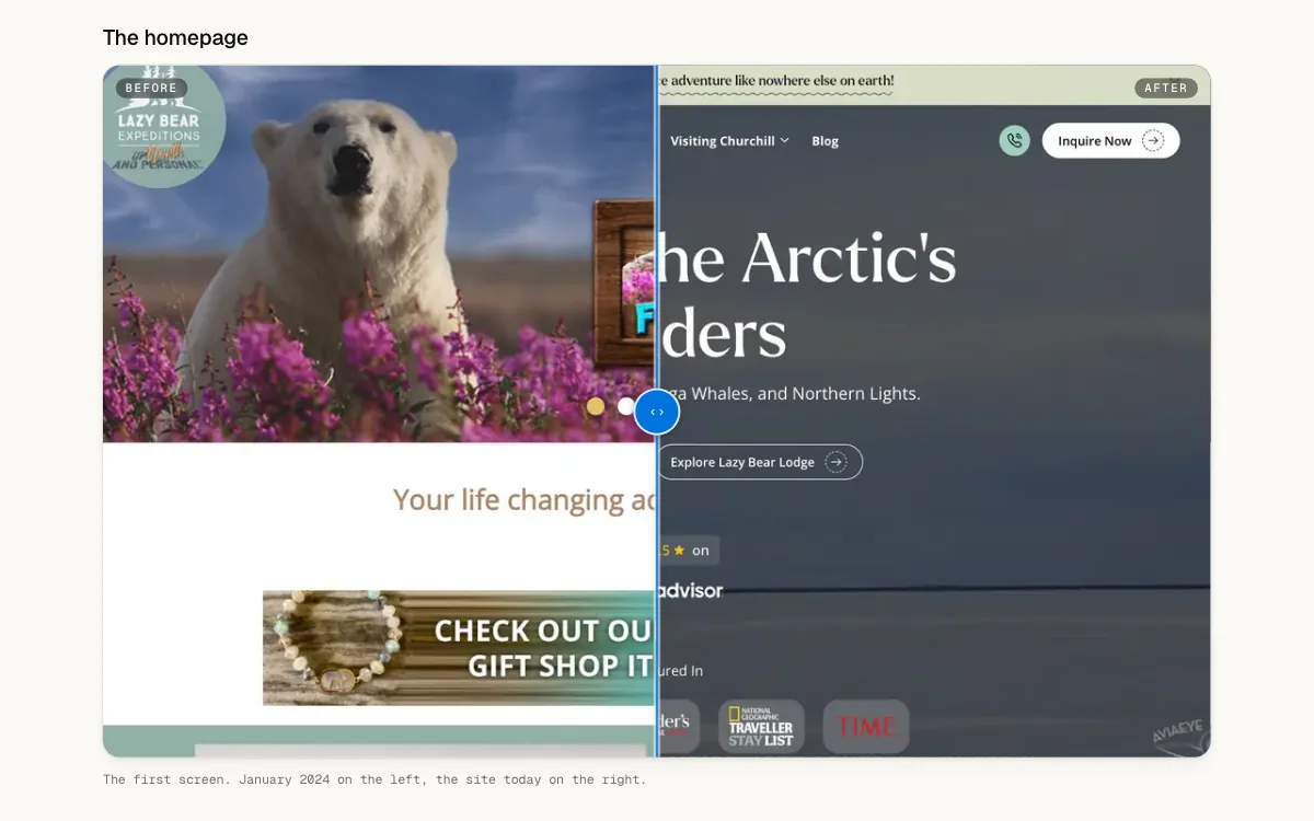
Marked in pen: drag to compare. Fixes and improvements
- Your assessment scores are drawn as a chart, revealed one at a time, and ranked weakest first on your roadmap
- A page of every category, each drawn as a folder holding three of its tools' logos
- Menus in the header open into panels, and on a phone the menu folds into three groups
- On a wide screen, use cases and briefs list their sections beside the text and mark where you are
- A link to a page unfurls with a card made for it: a tool's logo and price, a playbook's steps
Cards on phones, and this changelog
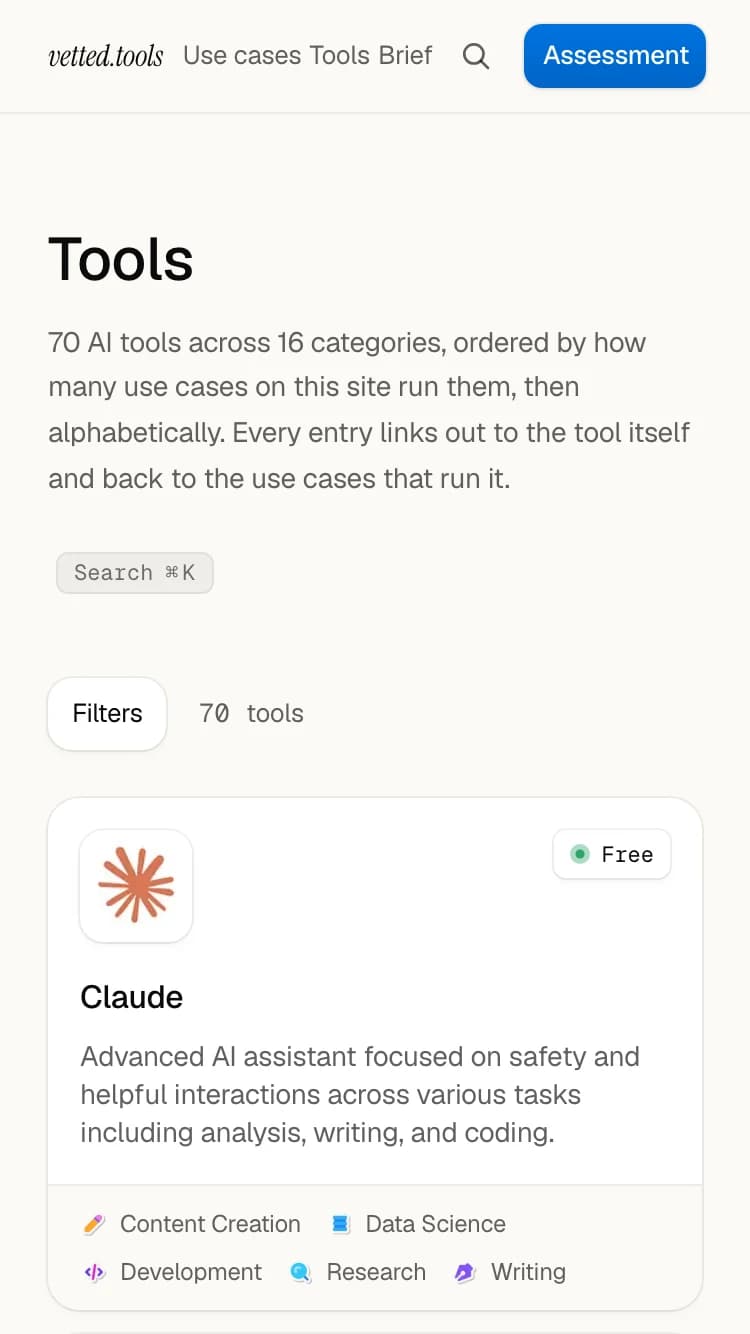
On a phone, use cases, the brief archive and the home teaser now show as cards, and the header opens a menu with an icon per page. This changelog began here.
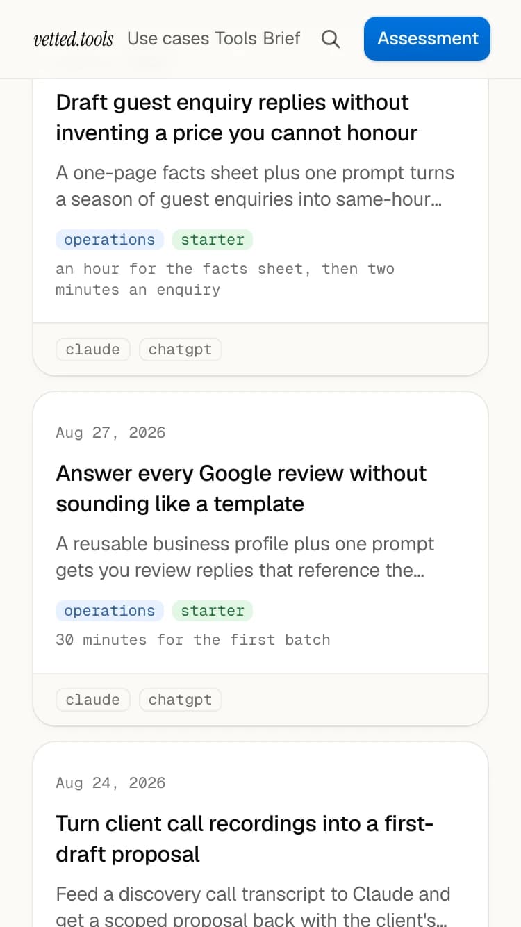
Marked in pen: a card per entry. Fixes and improvements
- Each release gets an entry here and a page of its own you can link to
- The header's background fades in as you scroll instead of snapping on
- The consulting and about pages alternate their section backgrounds, so each section stands apart
The wordmark, and headings that rank
Headings now step down in size the same way on every page, so main sections stand out from details. The header carries the vetted.tools wordmark again.
Marked in pen: the wordmark is back. Fixes and improvements
- Breadcrumbs on detail pages, and arrow keys to step from one tool to the next
- On a phone, the directory shows a card per tool
- Candidate tools come from three sources and must pass evidence checks before review
Every use case as a playbook
Every use case now follows the playbook format, and tool pages end with similar tools as cards with covers, so you can compare before you click away.
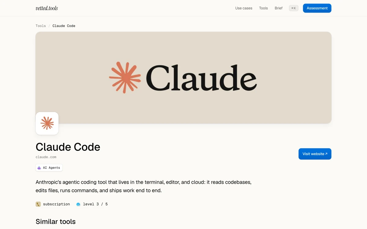
Marked in pen: a mark for each category. Fixes and improvements
- Every category and section has its own illustrated mark
- A tool with no usable cover image shows none, not a stand-in
- The table of contents no longer covers the page it sits on
- Copy buttons copy again
Lighter pages
Pages no longer carry the whole search index before they render. It now loads the moment you reach for search.
Fixes and improvements
- The local dev server no longer stalls reading the content folder
Use cases you can follow step by step
The first use case reads as a numbered playbook: each step gives a thing to make, a tip and a checkpoint. AI agents can now read the site over MCP.
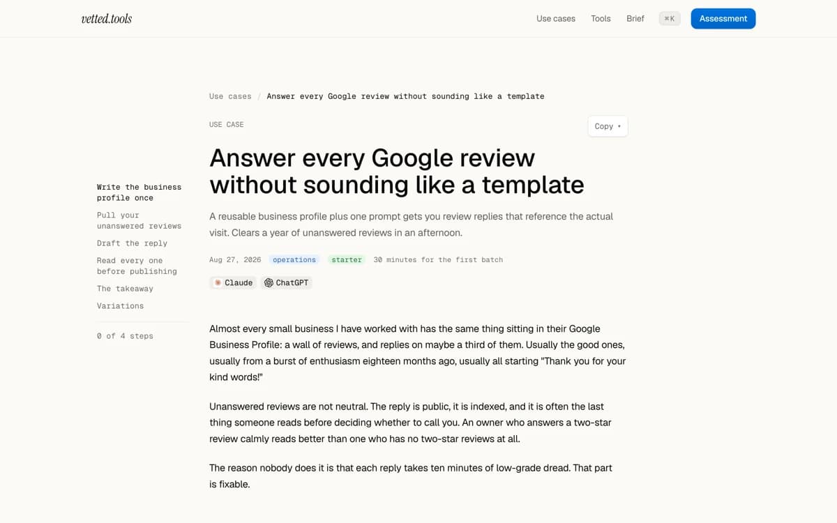
Marked in pen: 4 steps, in order. Fixes and improvements
- The MCP server is at /api/mcp: four read-only tools, no key and no sign-up
- Category pages link to the use cases that run their tools
- A question to the MCP server that is too long is refused, not quietly cut short
A clearer consulting page
The consulting page now opens on the path from AI-absent to AI-native, and every page on the site was rewritten in the same plain voice.
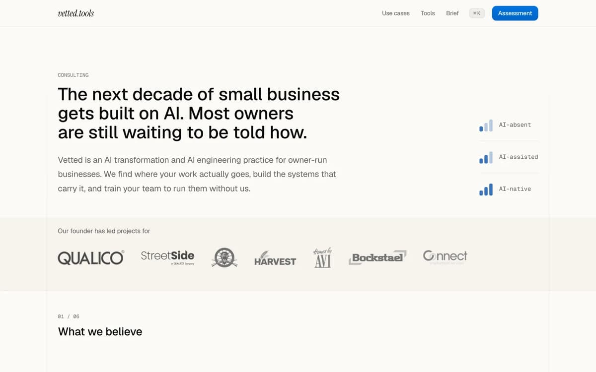
Marked in pen: absent to native. Fixes and improvements
- Tool pages close on their sources and four similar tools
- The tools page opens on its first 20 tools, with a button to show the rest
- Search works on a phone
- Privacy and terms pages, and a hey@vetted.tools address that reaches us
- A new site mark and favicon
One look across the site
Every page now shares one set of colours, corners, shadows and motion. The tool directory became a table you can filter, with a small mark per category.
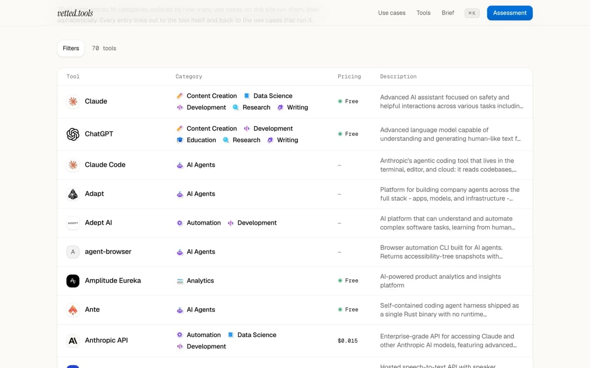
Marked in pen: filters, folded away. Fixes and improvements
- Copy any brief or use case as markdown, or as a prompt to paste into a chat
- An About page: who writes the site and how its pages are made
- The two consulting pages became one, and both old addresses redirect to it
- The design rules are written down, so each new page follows them
The weekly brief, drafted every Thursday
The weekly brief is now drafted every Thursday and sent once approved, so nobody gets it twice. If no draft lands, a shorter links-only issue goes out Friday.
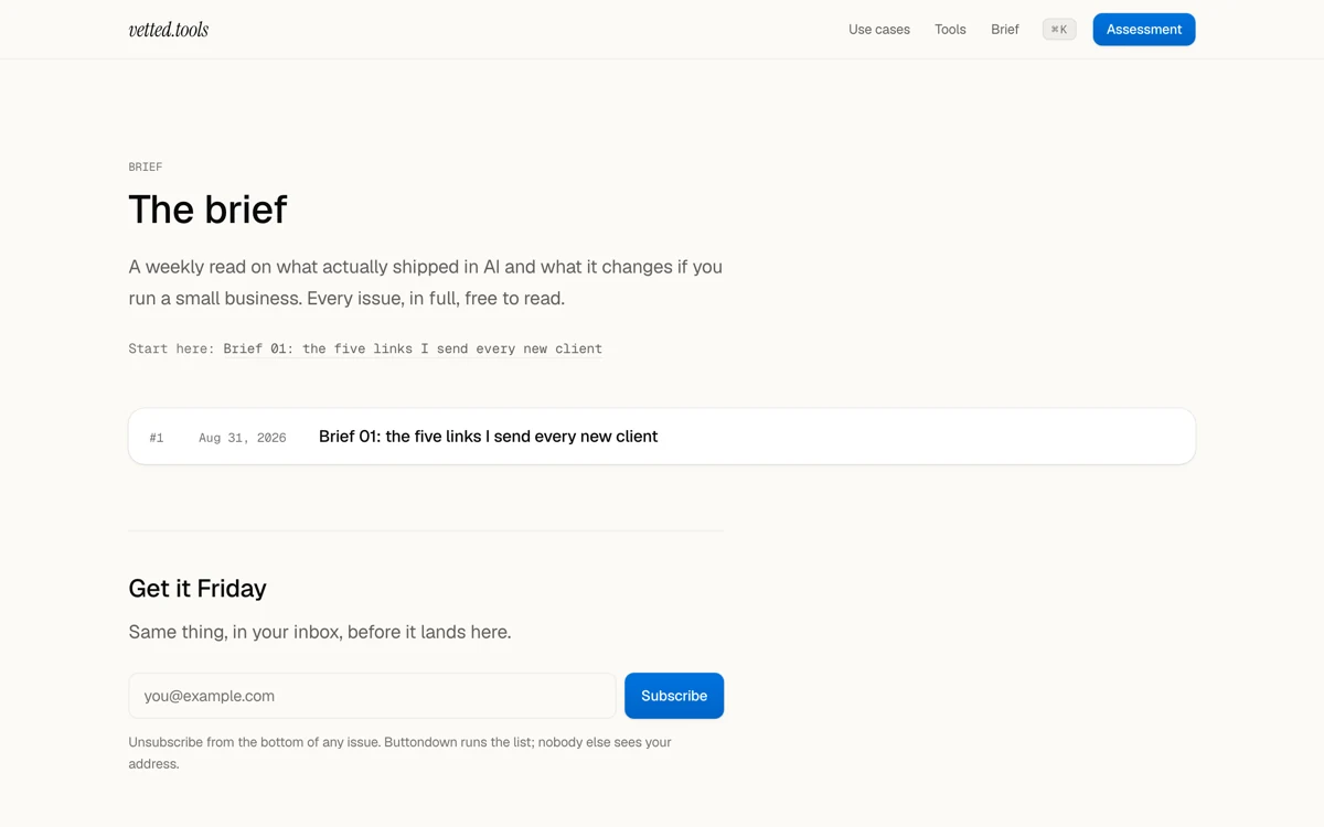
Marked in pen: one email a week. Fixes and improvements
- A links-only issue is labelled as a links digest, so you know it is the short one
- Links worth a mention are collected through the week, so each draft starts from a full queue
- An alert goes out if the Thursday draft ever stops running
- A draft run that crashes part way through is flagged and tidied up before the next one
The first version of the site
The site opened with an AI tool directory, a use-case library, the weekly brief and consulting pages. Take the readiness assessment, or press Cmd-K to search.
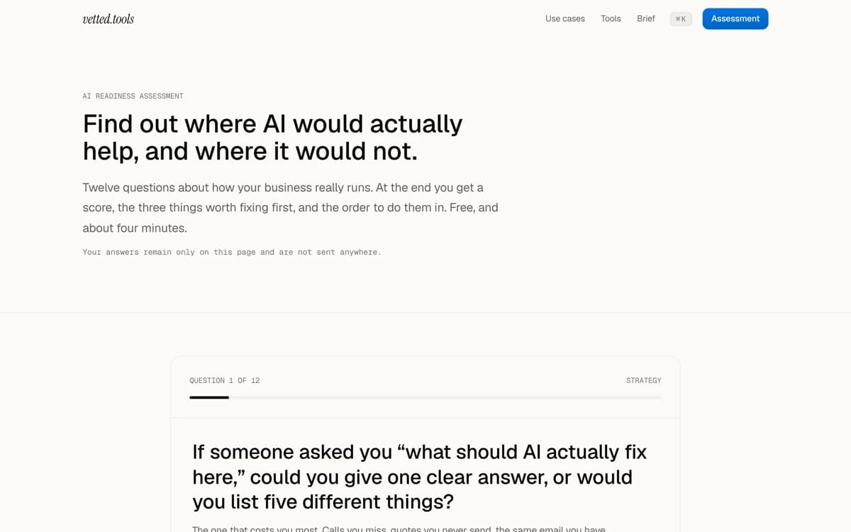
Marked in pen: scored in your browser.
Friday
The brief, by email
Every Friday, five to seven links, each with what to do about it.
Unsubscribe from any issue.