Our client work, case by case
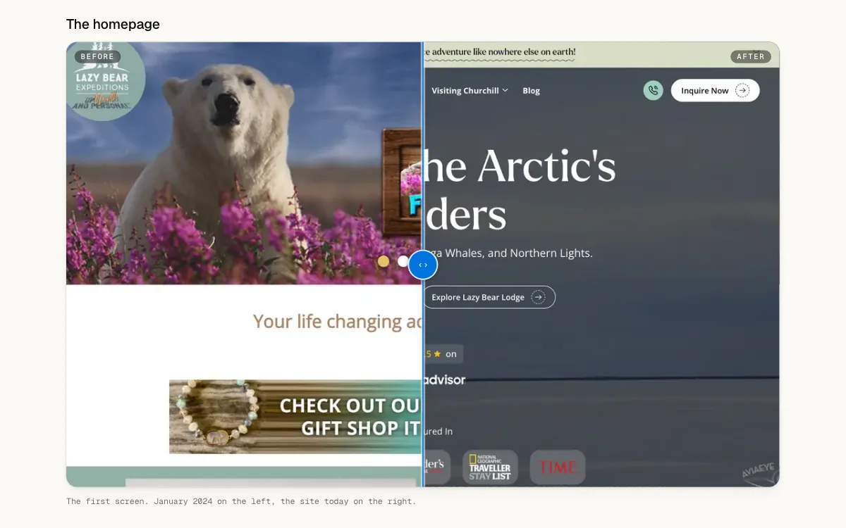
Each client engagement has its own page: what we delivered and, where we replaced a site, a slider to compare the old one with ours, section by section.
Fixes and improvements
- Your assessment scores are drawn as a chart, revealed one at a time, and ranked weakest first on your roadmap
- A page of every category, each drawn as a folder holding three of its tools' logos
- Menus in the header open into panels, and on a phone the menu folds into three groups
- On a wide screen, use cases and briefs list their sections beside the text and mark where you are
- A link to a page unfurls with a card made for it: a tool's logo and price, a playbook's steps