One look on every page
We pulled the redesign back into one site: every page title on one scale, plain paper under the reading, grain kept for a few bands, and one kind of closing section for each kind of page.
Fixes and improvements
- Forms and cards sit on solid white, never on grain
- Handwriting writes itself in as you scroll to it
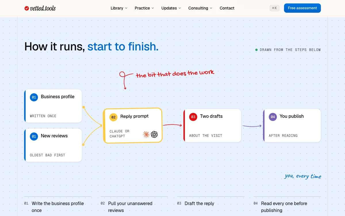
- Each use case has one process diagram, in colour, with its tools' logos
- This page shows the last eight weeks as a calendar, with release days ringed in coral
- The footer's links are 16px, and its social icons have bigger tap targets