Less scrolling on a phone
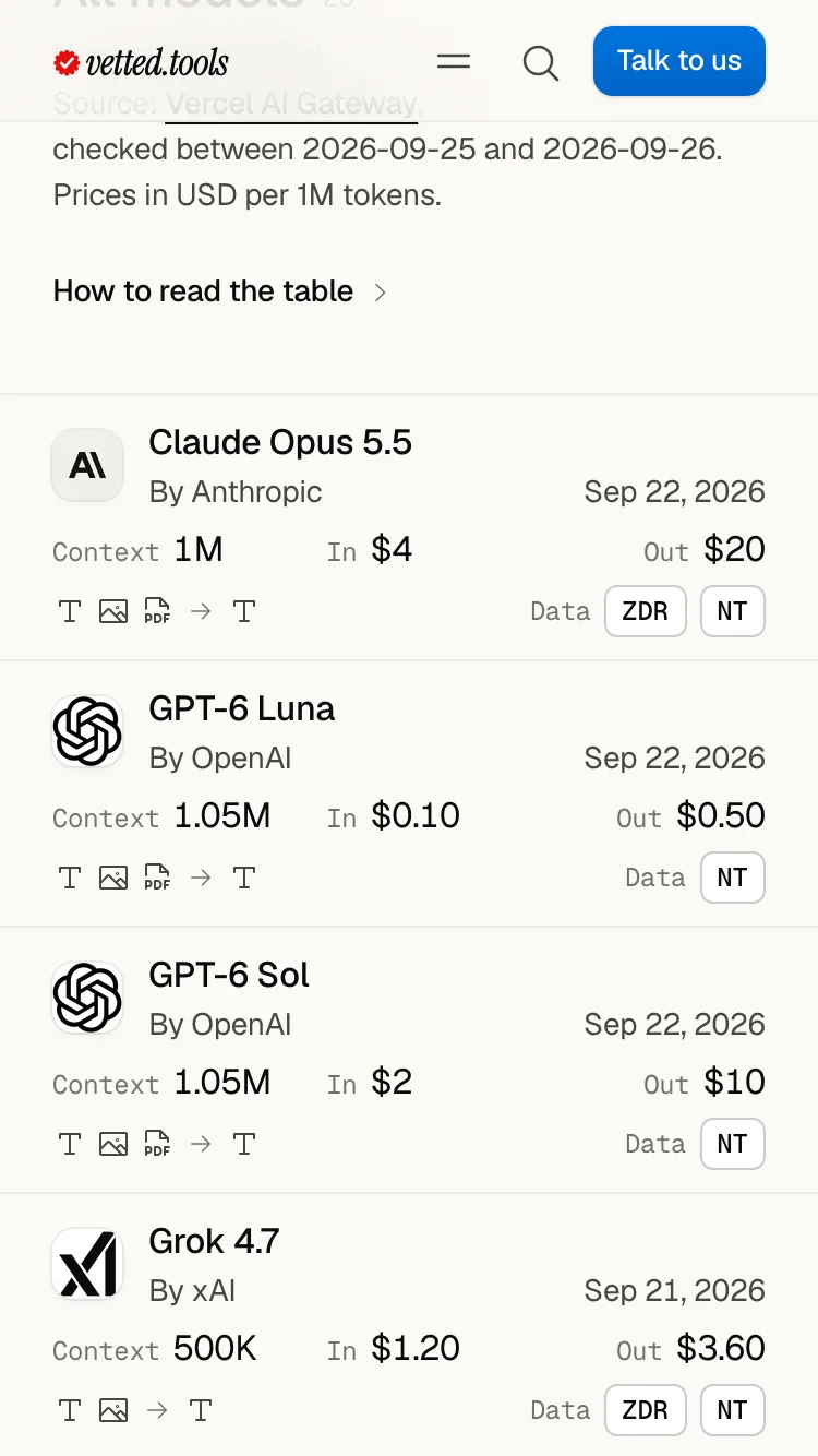
On a phone, the models list now shows about six models a screen where it showed four, and a use case's diagram is about 30% shorter. Same facts, less thumb.
Fixes and improvements
- A model is three lines on a phone: who made it and when, its context and prices, what it takes and its data marks
- There, the key to the models table is one line that opens, so the first model is on the first screen
- A step in a use case's diagram is one slim card with one number on a phone, even when two things feed it
- The diagram's pen notes fit a small phone, and its step links wait behind one line until you want them